Introduction to the Project
At Digital Solz, we pride ourselves on our ability to translate a client’s vision into stunning visual identities. Recently, we had the pleasure of working with a client on a logo for their website, Stationary For You.
Initial Design Phase
Our design team, known for their creativity and collaborative spirit, set to work on various design concepts. The initial phase involved brainstorming sessions where different ideas were sketched out and refined. Despite our best efforts, the first design did not meet the client’s expectations and was disapproved. Our team took this feedback constructively and continued to refine their ideas.
Refining the Vision
Undeterred by the initial setback, our team intensified their efforts to capture the essence of Stationary For You. Each new design iteration incorporated more insights and creativity. After several rounds of revisions, we were on our fourth design concept.
The Winning Concept
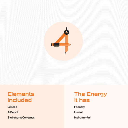
The fourth design finally struck a chord with the client. This logo cleverly integrated the idea of stationery within the design. The “4” in “Stationary 4 You” was uniquely styled using elements reminiscent of stationery items, creating a connection to the website’s purpose. Additionally, the design incorporated an Asian campus theme, blending traditional and modern elements to give the logo a distinct and memorable appearance.
Client Approval and Satisfaction
Our client was thrilled with this innovative and meaningful logo, which perfectly captured the spirit of their website, Stationary For You. The design not only met but exceeded their expectations, providing a distinctive and memorable visual identity for their brand.
Conclusion
At Digital Solz, we celebrate another successful collaboration and look forward to many more. Our ability to listen, adapt, and creatively innovate ensures that we consistently deliver exceptional results for our clients.


